Artokens geometric logo by Mihail Korubin

Artokens are an original visual art language created by artist Mihail Korubin, in which words, emotions, and ideas are transformed into geometric symbols.

ARTOKENS CATEGORIES

Artokens™ are visual reflections of the world, capturing the essence of a form
or idea through the prism of a few nearly flawless geometric shapes and
transforming them into a pure, minimal, symbol-like concept.

Supreme Artokens are expressive, hand-drawn compositions of geometric ideas that represent selected words of deeper meaning. 

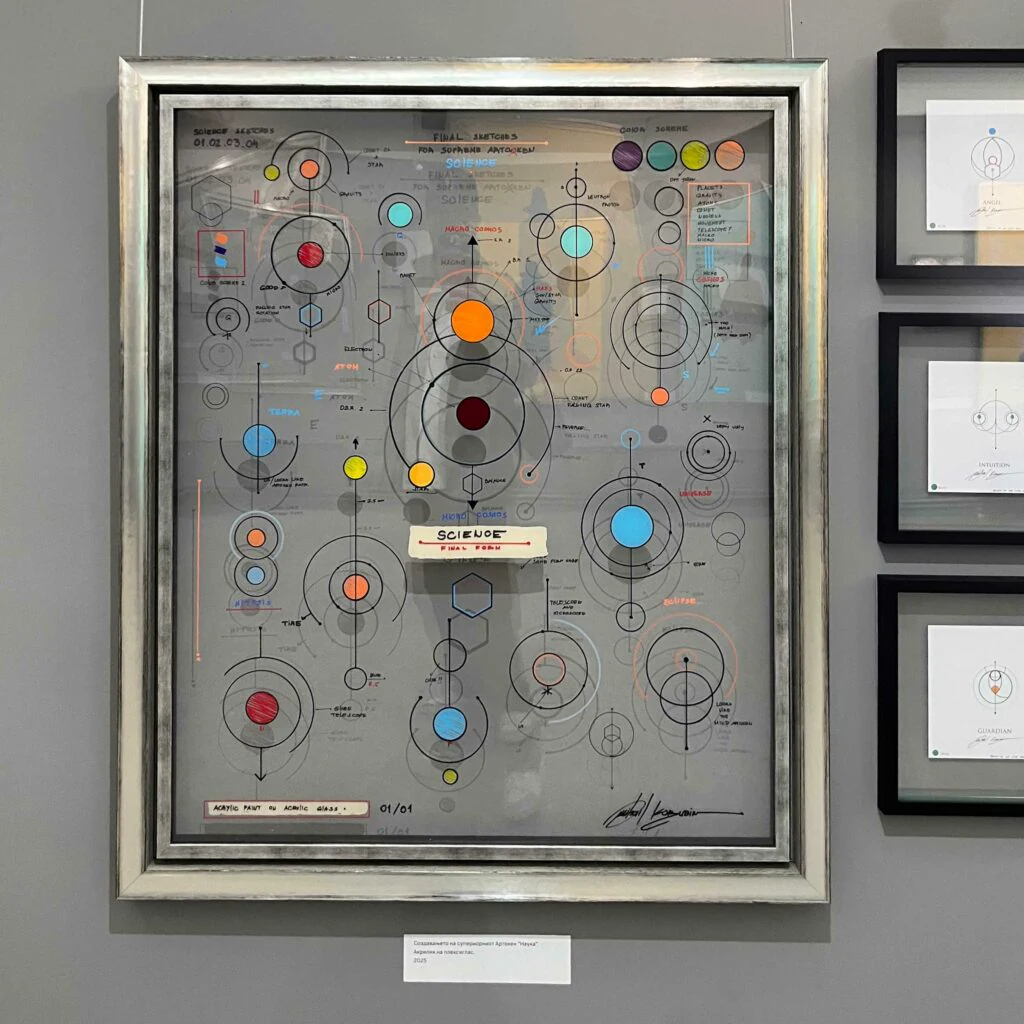
Artokens Genesis Series consists of original Artokens artworks hand-painted by Mihail using acrylic paint on double-layer acrylic glass. 

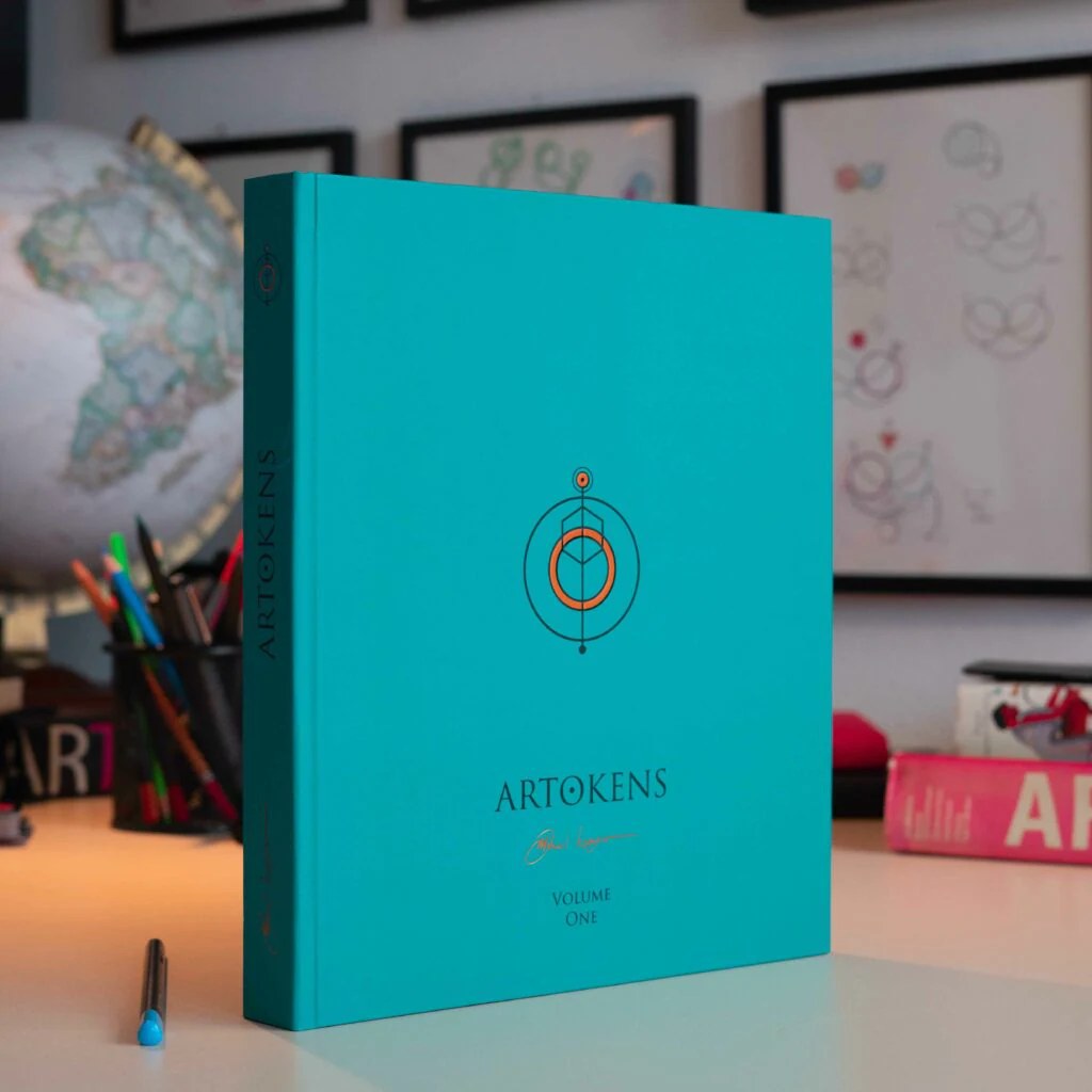
Volume One is the first book dedicated to the Artoken universe. It details the origins, rules, and structure of Artoken symbols, including both Supreme and Primary Artokens.

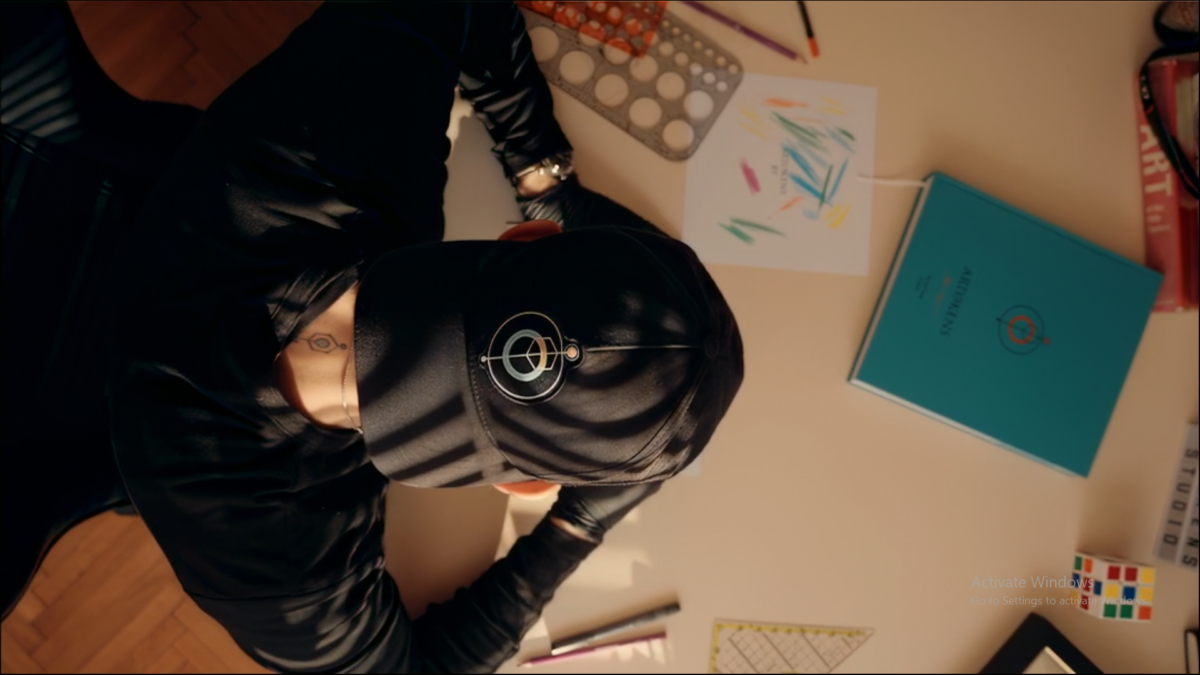
Discover the Artokens × Bratot cap. Gift cards coming soon.

A weekly discovery

GUESS THE ARTOKEN

Five Supreme Artokens. Look closely, choose a word, and discover the drawing.
A new selection every Monday.

What Are Artokens?

Artokens explore art as a visual language, transforming words, emotions, and ideas into geometric symbols. Built from circles, equilateral triangles, hexagons, and straight lines, each Artoken expresses the essence of a concept through a carefully constructed visual form.

The language includes Primary Artokens, minimalist geometric pictograms that can be combined to create sentences, and Supreme Artokens, more elaborate and expressive interpretations of selected words with special significance.

Artokens explore the relationship between art, symbolism, geometry, and visual communication, transforming written meaning into a visual experience.

Explore the origins and rules in Artokens Book—Volume One.

Artokens are created and originated by the visual artist Mihail Korubin. The term ‘Artokens’ is formed by combining ‘Art’ and ‘Tokens,’ signifying artistic expression through visually symbolic depictions of linguistic concepts.

ARTOKENS DEFINITION

Artokens are visual reflections of the world, capturing the essence of a form or idea through the prism of a few nearly flawless geometric shapes and transforming them into a pure, minimal, symbol-like concept.

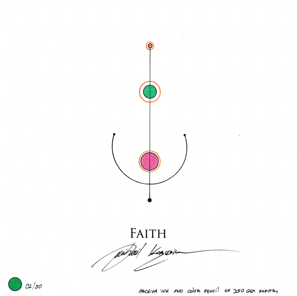
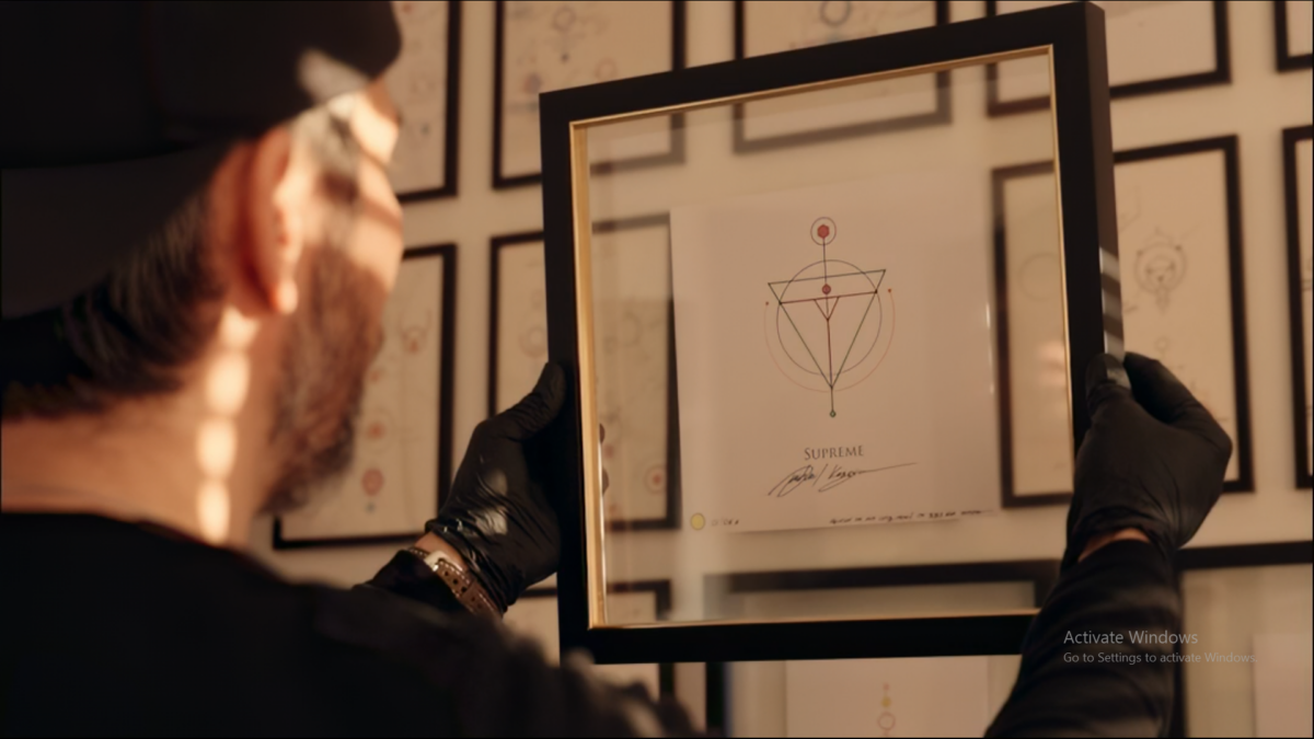
Faith Supreme Artoken by Mihail Korubin, with colored geometric forms and the artist’s signature
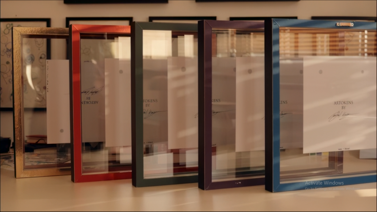
Five Supreme Artokens displayed in blue, purple, green, red and gold-colored frames

SPECIFICATIONS

Every Supreme Artoken is created in one standard size and style, with color as the only variation for special or limited editions. No alternate formats are available.

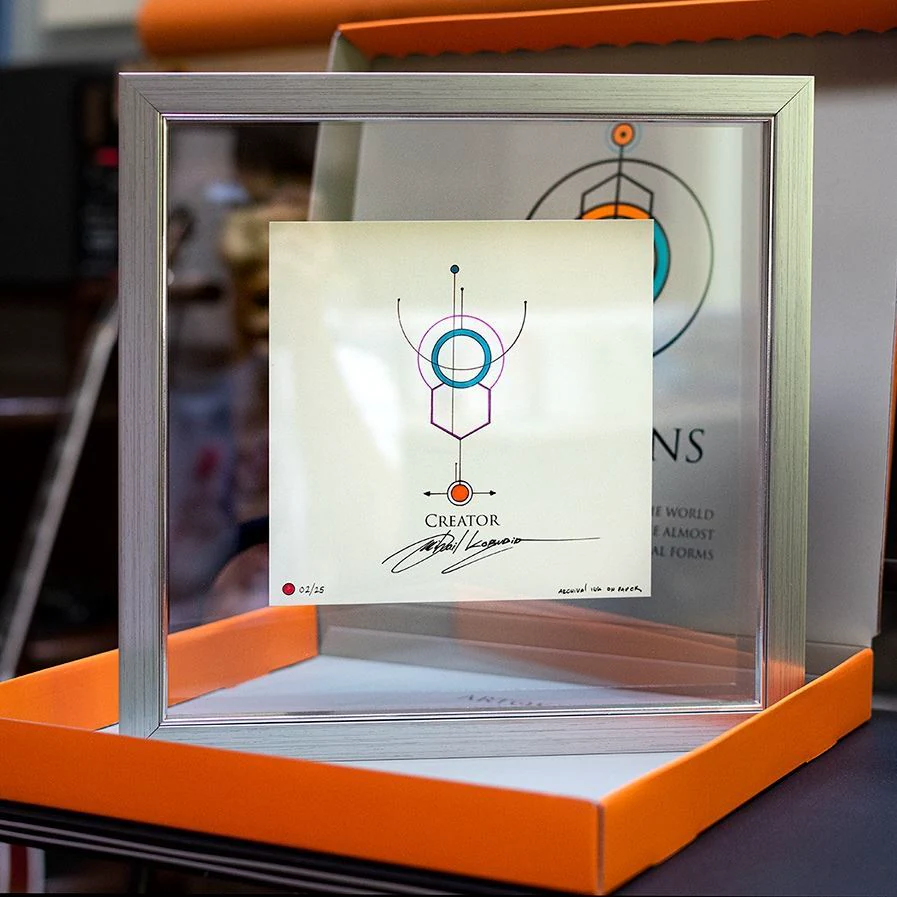
Each piece measures 35 × 35 cm, is professionally framed in clear glass with a handcrafted wooden frame, and arrives ready to hang.

All Supreme Artokens are hand-drawn, hand-signed, and individually numbered by Mihail Korubin. Each includes a certificate of authenticity, a unique serial code, and custom packaging.

Limited Edition: Each word is created only once. Once an edition sells out, it will never be reproduced. Supreme Artokens are released at different times.

Colors and numeration

Blue edition 100 pieces
Green edition 50 pieces
Purple edition 75 pieces
Red edition 25 pieces
Golden Sun edition 2 × 5 pieces

LIMITED EDITIONS

Supreme Artokens are released in five distinct color editions, each with a specific production limit determined by the rarity and symbolic power of the word it represents.

For example, the word Sunset, while powerful, is a common experience. Its Blue Edition is therefore limited to 100 pieces. In contrast, Anomaly represents a rare and powerful occurrence. As a result, its Gold Edition is limited to only 10 pieces.

SHAPES

Artokens use only straight lines and three shapes—hexagons, equilateral triangles, and circles—as the foundation for visual language.

ACCENTS

Arrows and dots may be added for direction, emphasis, or grammar, but are not counted as core shapes.

COMPOSITION AND SHAPE LIMITS

Each Artoken, including Supreme versions, can use up to 18 geometric shapes (excluding dots and arrows). This limit encourages creativity within a defined structure. Using all 18 shapes isn’t necessary—often, Artokens with fewer shapes are more memorable and visually impactful.

Artoken construction diagram with ten numbered geometric components
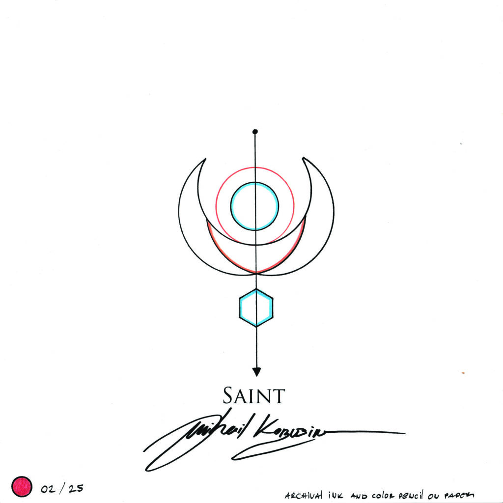
Saint Supreme Artoken by Mihail Korubin, with colored geometric forms and the artist’s signature

Supreme Artokens

Supreme Artokens are visually more complex and in color, representing words with special or deeper meaning—often poetic, mystical, or significant. They are larger, more versatile, and designed to stand out, offering a richer layer of expression. Only chosen words from the Artoken universe have a supreme version.

Primary Artoken shown as a black geometric symbol

Primary Artokens

Primary Artokens are geometric pictograms for writing with symbols. Their minimal, monochromatic forms can be combined into sentences, much like writing with a pencil in a notebook. Every word in the Artokens lexicon has a Primary Artoken—including conjunctions, prepositions, numbers, and colors—but not all have a Supreme version, even though they remain essential for expressing feelings, emotions, and abstract concepts.

Artokens: Writing with Geometric Symbols

A geometric drawing can be appreciated through its balance, rhythm and form. But what happens when that drawing also represents a word? A circle or a triangle becomes part of something we can both look at and read.

This relationship between image and meaning is central to Artokens, the visual art language created by artist Mihail Korubin. Artokens bring geometric symbols, symbolic drawings and written expression into a shared artistic practice. Each drawing gives a word or idea a particular visual form; together, these forms can participate in sentences.

Between a drawing and a sign

A drawing can suggest many things without having a fixed meaning. A written sign, by comparison, needs an established relationship with what it represents. Artokens work across these possibilities: they have defined meanings within a vocabulary, while their compositions remain expressions of the artist’s interpretation.

The first Artoken, Sunset, grew from observing the sun descending below a watery horizon. Korubin wanted to capture the geometry of that experience in a symbol-like artwork. The next drawing, Freedom, moved towards an abstract concept.

That movement—from an observable event to an idea—helps explain the scope of Artokens. Their subject can be something seen, something felt or something considered. The drawing becomes a meeting point between the word, the artist’s response and the viewer’s encounter with the form.

Geometric symbols as an artistic vocabulary

Geometry gives Artokens their shared structure. Every composition is constructed using straight lines, circles, equilateral triangles and hexagons. A maximum of 18 geometric shapes is permitted within an individual Artoken, excluding supplementary dots and arrows.

These rules make geometry an active part of the creative process. Different meanings must emerge through changes in arrangement, scale, combination and the relationships between a limited number of components.

Partial shapes are permitted, and overlapping components can produce the appearance of other forms. Their underlying structure must nevertheless remain consistent with the allowed geometry.

This is what connects separate Artokens visually. Their meanings vary, but their construction belongs to the same world. Geometry becomes a vocabulary through which nature, emotions and abstract ideas can receive distinct yet related expressions.

Pictograms in art: recognising an image

Pictograms offer one useful way to approach the relationship between a picture and what it represents. In the Artokens book, Korubin describes Primary Artokens as geometric pictograms.

Some Artokens contain visual relationships that become recognisable through their subject. In Horizon, for example, a blue line represents the ocean, while an orange circle represents the setting sun. The composition connects a word to the geometry and colour of an observed scene.

However, Artokens also extend into concepts that have no single visible appearance. A feeling such as freedom cannot be drawn in the same way as an object. It requires choices about what might express its character.

Within this practice, pictorial recognition is therefore one possible route to meaning. Explanation and familiarity with the vocabulary provide others.

Ideograms and the representation of ideas

The term ideogram offers another point of comparison: a visual sign can stand for an idea rather than reproduce the appearance of a thing. This helps readers approach the conceptual side of Artokens, although “ideogram” is a comparison here rather than a replacement for Korubin’s terminology.

In Essence, blue represents water and a yellow circle represents the sun. These elements appear within an embryo-like composition. The book explains their relationship through their importance to the creation of life.

Understanding this drawing involves connecting its components to a larger thought. Its meaning develops through symbolism and the relationships the artist establishes between forms.

The distinction matters: a symbol may invite an immediate emotional response, while its intended meaning takes longer to learn.

Symbolism within a defined visual language

Symbolism allows a visible form to carry an association beyond itself. In Artokens, colour, geometry and composition contribute to this process. Colour can clarify a reference, as in Horizon, or respond to the feeling evoked by a more abstract word.

These associations belong to particular artworks and the explanations accompanying them. They do not make every Artoken automatically understandable to every viewer.

Artokens combine this interpretive dimension with a defined vocabulary. Their identity comes from the relationship between artistic expression and a system that can be learned.

When symbolic drawings become writing

Primary Artokens make this relationship especially clear. Their simplified, monochromatic forms allow separate symbols to combine into sentences while maintaining a consistent visual character. Pronouns, verbs, prepositions and grammatical markers connect expressive concepts into larger statements.

Supreme Artokens give selected words more elaborate, colourful forms. Every Supreme Artoken has a Primary counterpart, allowing a concept to move between an individual artwork and a written composition.

Artokens therefore offer two connected experiences: contemplating a symbolic drawing and reading it in relation to others. Artokens Book – Volume One explores that connection through construction rules, vocabulary, sentence examples and 75 hand-drawn Supreme Artokens with related sketches and explanations. It gives readers a way to discover how geometric form becomes artistic expression—and how that expression becomes visual language.

Artokens symbol

Read about the Artokens

Artokens are created and originated by the visual artist Mihail Korubin. The term ‘Artokens’ is formed by combining ‘Art’ and ‘Tokens,’ signifying artistic expression through visually symbolic depictions of linguistic concepts.

ARTOKENS DEFINITION

Artokens are visual reflections of the world, capturing the essence of a form or idea through the prism of a few nearly flawless geometric shapes and transforming them into a pure, minimal, symbol-like concept.

Faith Supreme Artoken by Mihail Korubin, with colored geometric forms and the artist’s signature

SPECIFICATIONS

Every Supreme Artoken is created in one standard size and style, with color as the only variation for special or limited editions. No alternate formats are available.

Each piece measures 35 × 35 cm, is professionally framed in clear glass with a handcrafted wooden frame, and arrives ready to hang.

All Supreme Artokens are hand-drawn, hand-signed, and individually numbered by Mihail Korubin. Each includes a certificate of authenticity, a unique serial code, and custom packaging.

Limited Edition: Each word is created only once. Once an edition sells out, it will never be reproduced. Supreme Artokens are released at different times.

Five Supreme Artokens displayed in blue, purple, green, red and gold-colored frames

LIMITED EDITIONS

Supreme Artokens are released in five distinct color editions, each with a specific production limit determined by the rarity and symbolic power of the word it represents.

For example, the word Sunset, while powerful, is a common experience. Its Blue Edition is therefore limited to 100 pieces. In contrast, Anomaly represents a rare and powerful occurrence. As a result, its Gold Edition is limited to only 10 pieces.

Colors and numeration

Blue edition 100 pieces
Green edition 50 pieces
Purple edition 75 pieces
Red edition 25 pieces
Golden Sun edition 2 × 5 pieces
Supreme Artokens color editions: Blue 100, Purple 75, Green 50, Red 25, Golden Sun 2 × 5

SHAPES

Artokens use only straight lines and three shapes—hexagons, equilateral triangles, and circles—as the foundation for visual language.

ACCENTS

Arrows and dots may be added for direction, emphasis, or grammar, but are not counted as core shapes.

COMPOSITION AND SHAPE LIMITS

Each Artoken, including Supreme versions, can use up to 18 geometric shapes (excluding dots and arrows). This limit encourages creativity within a defined structure. Using all 18 shapes isn’t necessary—often, Artokens with fewer shapes are more memorable and visually impactful.

Artoken construction diagram with ten numbered geometric components

Supreme Artokens are visually more complex and in color, representing words with special or deeper meaning—often poetic, mystical, or significant. They are larger, more versatile, and designed to stand out, offering a richer layer of expression. Only chosen words from the Artoken universe have a supreme version.

Saint Supreme Artoken by Mihail Korubin, with colored geometric forms and the artist’s signature

Primary Artokens are geometric pictograms for writing with symbols. Their minimal, monochromatic forms can be combined into sentences, much like writing with a pencil in a notebook. Every word in the Artokens lexicon has a Primary Artoken—including conjunctions, prepositions, numbers, and colors—but not all have a Supreme version, even though they remain essential for expressing feelings, emotions, and abstract concepts.

Primary Artoken shown as a black geometric symbol

Artokens: Writing with Geometric Symbols

A geometric drawing can be appreciated through its balance, rhythm and form. But what happens when that drawing also represents a word? A circle or a triangle becomes part of something we can both look at and read.

This relationship between image and meaning is central to Artokens, the visual art language created by artist Mihail Korubin. Artokens bring geometric symbols, symbolic drawings and written expression into a shared artistic practice. Each drawing gives a word or idea a particular visual form; together, these forms can participate in sentences.

Between a drawing and a sign

A drawing can suggest many things without having a fixed meaning. A written sign, by comparison, needs an established relationship with what it represents. Artokens work across these possibilities: they have defined meanings within a vocabulary, while their compositions remain expressions of the artist’s interpretation.

The first Artoken, Sunset, grew from observing the sun descending below a watery horizon. Korubin wanted to capture the geometry of that experience in a symbol-like artwork. The next drawing, Freedom, moved towards an abstract concept.

That movement—from an observable event to an idea—helps explain the scope of Artokens. Their subject can be something seen, something felt or something considered. The drawing becomes a meeting point between the word, the artist’s response and the viewer’s encounter with the form.

Geometric symbols as an artistic vocabulary

Geometry gives Artokens their shared structure. Every composition is constructed using straight lines, circles, equilateral triangles and hexagons. A maximum of 18 geometric shapes is permitted within an individual Artoken, excluding supplementary dots and arrows.

These rules make geometry an active part of the creative process. Different meanings must emerge through changes in arrangement, scale, combination and the relationships between a limited number of components.

Partial shapes are permitted, and overlapping components can produce the appearance of other forms. Their underlying structure must nevertheless remain consistent with the allowed geometry.

This is what connects separate Artokens visually. Their meanings vary, but their construction belongs to the same world. Geometry becomes a vocabulary through which nature, emotions and abstract ideas can receive distinct yet related expressions.

Pictograms in art: recognising an image

Pictograms offer one useful way to approach the relationship between a picture and what it represents. In the Artokens book, Korubin describes Primary Artokens as geometric pictograms.

Some Artokens contain visual relationships that become recognisable through their subject. In Horizon, for example, a blue line represents the ocean, while an orange circle represents the setting sun. The composition connects a word to the geometry and colour of an observed scene.

However, Artokens also extend into concepts that have no single visible appearance. A feeling such as freedom cannot be drawn in the same way as an object. It requires choices about what might express its character.

Within this practice, pictorial recognition is therefore one possible route to meaning. Explanation and familiarity with the vocabulary provide others.

Ideograms and the representation of ideas

The term ideogram offers another point of comparison: a visual sign can stand for an idea rather than reproduce the appearance of a thing. This helps readers approach the conceptual side of Artokens, although “ideogram” is a comparison here rather than a replacement for Korubin’s terminology.

In Essence, blue represents water and a yellow circle represents the sun. These elements appear within an embryo-like composition. The book explains their relationship through their importance to the creation of life.

Understanding this drawing involves connecting its components to a larger thought. Its meaning develops through symbolism and the relationships the artist establishes between forms.

The distinction matters: a symbol may invite an immediate emotional response, while its intended meaning takes longer to learn.

Symbolism within a defined visual language

Symbolism allows a visible form to carry an association beyond itself. In Artokens, colour, geometry and composition contribute to this process. Colour can clarify a reference, as in Horizon, or respond to the feeling evoked by a more abstract word.

These associations belong to particular artworks and the explanations accompanying them. They do not make every Artoken automatically understandable to every viewer.

Artokens combine this interpretive dimension with a defined vocabulary. Their identity comes from the relationship between artistic expression and a system that can be learned.

When symbolic drawings become writing

Primary Artokens make this relationship especially clear. Their simplified, monochromatic forms allow separate symbols to combine into sentences while maintaining a consistent visual character. Pronouns, verbs, prepositions and grammatical markers connect expressive concepts into larger statements.

Supreme Artokens give selected words more elaborate, colourful forms. Every Supreme Artoken has a Primary counterpart, allowing a concept to move between an individual artwork and a written composition.

Artokens therefore offer two connected experiences: contemplating a symbolic drawing and reading it in relation to others. Artokens Book – Volume One explores that connection through construction rules, vocabulary, sentence examples and 75 hand-drawn Supreme Artokens with related sketches and explanations. It gives readers a way to discover how geometric form becomes artistic expression—and how that expression becomes visual language.

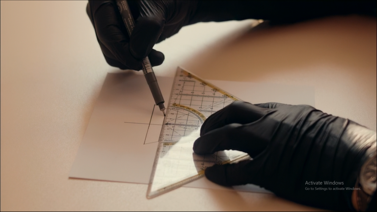
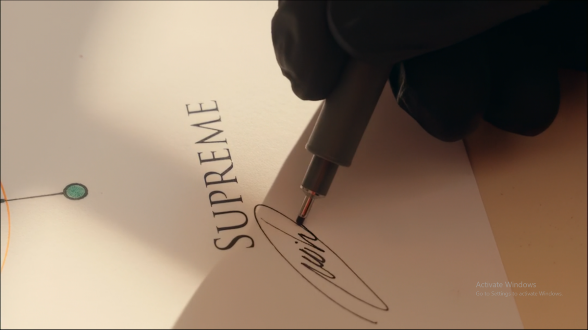
Artokens studio and artistic process

ARTOKENS

The world,
in symbols.

Artokens™ are visual reflections of the world, capturing the essence of a form or idea through the prism of a few nearly flawless geometric shapes and transforming them into a pure, minimal, symbol-like concept.


Artokens are created and originated by the visual artist Mihail Korubin. They represent the core essence of words and ideas using geometric symbols. These artworks depict the universe with a minimalist aesthetic, crafted from a select few nearly flawless geometric shapes. The term ‘Artokens’ is formed by combining ‘Art’ and ‘Tokens,’ signifying artistic expression through visually symbolic depictions of linguistic concepts.

ARTOKENS FUNDAMENTALS


Basic Components

Artokens use only straight lines and three geometric shapes: hexagons, equilateral triangles, and circles. These simple forms are the foundation for expressing words and ideas, allowing for creativity within a clear structure.

Accents

Arrows and dots can be added to show direction or serve as design accents and grammatical markers. They are additions, not counted as part of the main geometric shapes.

Artoken construction diagram with ten numbered geometric components

Composition and Shape Limits

Each Artoken, including Supreme versions, can include up to 18 geometric shapes (not counting dots and arrows). Using all 18 shapes isn’t required—often, simpler designs are more striking.

Supreme vs. Primary Artokens

Supreme Artokens are more complex and colorful and are used for words with special meaning or significance. Primary Artokens are simpler, monochrome, and used for everyday writing, covering every word in the Artoken language. (More about primary Artokens in the Artokens book—Volume 1)

Artoken construction diagram showing overlapping circles, partial shapes and a hexagon

Partial Shapes

Shapes don’t have to be used fully—halves or thirds are allowed, depending on the design.

Shape Restrictions

Only hexagons, equilateral triangles, and circles are permitted. Sometimes, overlaps may create the illusion of new shapes, but only the three core shapes are officially used.

Maintaining Structure

All shapes must keep their original proportions (for example, triangles must always be equilateral) to preserve consistency and integrity in Artoken design.


1. Every Supreme Artoken is always the same dimension and is framed in the same manner. Only the color of the edition or the unique special edition, Artokens, can change. The Artokens cannot be purchased in a different format. 

2. All Supreme Artokens are 35 cm x 35 cm. Every Supreme Artoken is framed between two sets of crystal-clear glass, finished with a handcrafted wooden frame with a metal finish or black finish, and is ready to be mounted. 

3. Every Supreme Artoken is hand-drawn, hand-signed, and numbered by Mihail Korubin. 

4. Artokens are accompanied by a certificate of authenticity and are packed in a specially designed box. Each Artoken has a serial code that prevents forgery. 

LIMITED EDITION NOTE:

Important: New designs for words that have already been made will never be repeated. For example, there will be only one artwork for the word “Eternal,” and once all pieces are purchased, that Artoken will never be drawn and sold again in its original form as an Artoken. Not all Artokens will be available at the same time. 

Are you a collector?